
First Feisty Type Studio logo animation test.
Branding the brander
A taste of my
own medicine
An honest brand case study, wobbles included, on the hardest client I've ever had: me. How a senior editorial designer built a fractional design studio in Ireland.
A happy, dancing feisty mascot takes a spin and the word mark getting some bling. Background: why I started a fractional design studio
I've worked in design and production for almost 20 years, and I've watched the job change dramatically. Videographer, web designer, social media manager: they've all folded into one title of graphic designer, all in one salary and big companies are shrinking their in-house design teams too. Something else I experienced looking for work was hiring leads rarely connect digital design with editorial design, even though it's the same eye at work. If anything, editorial designers are sharper for it: print gives you one shot, no do-overs, so you learn to work fast and get it right.
After years of freelancing under my own name I felt it was a little boring, using an alias allows me to almost adopt a persona, something I can be more playful with. What was the biggest catalyst to starting my own studio was that, as a freelancer, I was never really part of a team, so my responsibility (and my creative license) stayed capped: in, do the shift, hand over the files, out the door. I knew I had more in me.
So I kept training (web design, motion, UX, social media for business, a bit of Blender and worked towards one goal: my own studio, built to use everything I'd learned. Eventually, I stopped hoping for the right role to open up, and built it myself.
2. The challenge: Why branding your
own design studio is so hard
You are your own worst client. Vague brief, shifting goalposts, emotionally attached to everything.
The niche problem. With a billion brand designers out there, "I can do a bit of everything" is the worst positioning line going. My breadth wasn't the problem; my framing of it was.
The model problem. I knew I didn't want classic freelancing (a paid shift and out the door). But "not freelancing" isn't an offer on its own.
The taste problem. I spent weeks auditioning expensive paid typefaces, convinced a type nerd's brand needed a rare licensed font. It didn't (see Design).
The confidence problem. A name like "Feisty" sets a bar: cheeky and warm, without undermining two decades of editorial discipline. Early drafts fell off that tightrope on both sides.
3. Strategy: positioning a brand designer
in a crowded market
The turning point: I was competing with a billion brand designers on the wrong ground. Very few specialise in taking static brands to digital, so I built the studio around this gap instead.
Specialise in the gap, not the discipline. Plenty of designers build static identities; plenty of motion designers animate whatever they're handed. Few own the handover: taking a brand from a rough idea to a full digital-ready system.
Sell embeddedness, not hours. The offer became fractional design support: senior, ongoing help for companies that need a design lead, just not every day.
Let typography carry the story. Years in editorial and print design taught me the art of communication at its most disciplined. Hence the name: Feisty Type.
Adding branding to the start of this video cost view.Feisty Type Studio mascot exploration sheet showing six colour and style variations of the winking face.4. Brand pillars and positioning
Positioning statement:Feisty Type Studio is a fractional design partner that takes brands from static to digital: embedded senior creative support for companies that need a creative lead - on call
The four brand pillars:
1. Reliable. professional, no drama, no hand-holding required.
2. Type does the talking. Editorial-grade typography communicates first, decorates second.
3. Built to move. Identities and systems that are digital-ready from day one: logos that animate, layouts that transition.
4. Feisty, not flippant. Cheeky and warm on the surface, rigorous and senior underneath.
The video test: a wobble worth sharing. For the studio soft launch, I shared the same hero video used on the website across LinkedIn and Instagram. A few weeks later, I put out a second video: the marketing piece on the left about the benefits of digital marketing for business. This one opened with a three-second logo sting before the content began.
The impact was clear. The launch video outperformed the second on every measure that mattered: reach was down 74 to 96% on the follow-up, and viewers dropped off right around the 13-second mark, likely the wait for that branded intro, not the message itself. The lesson landed quickly: content first, branding last. A logo sting feels professional to make, but to a scrolling viewer it reads as "here comes an ad," and it cost precious seconds before the hook even arrived.
It's a small misstep, but a useful one, and exactly the kind of thing this case study exists to admit.
Another lesson was using Squarespace for a video-dense website; next year I will rebuild in Framer, which is designed to facilitate video better.
#191919
Editorial authority; carries the typographic discipline.
#F4F4F4
Neutral. Print-paper warmth, breathing room, and dark-mode-safe backgrounds.
#C872DD
Secondary. Playful energy for motion and digital moments.
#EBC743
Primary. Confidence and warmth; the "feisty" in the brand.
#0781e5
5. Design: the logo, typeface
and colour palette decisions
My type of typeface: After weeks trying gorgeous paid fonts, I opted for Work Sans. Free. Open source. Available on every digital platform. The type nerd picks the free font?! But it was actually the strategy proving itself: a studio built on "digital-ready everywhere" needs a workhorse typeface that renders on every platform without licensing friction. Work Sans is warm, sturdy and a little characterful. It fits me. Practicality is the craft.
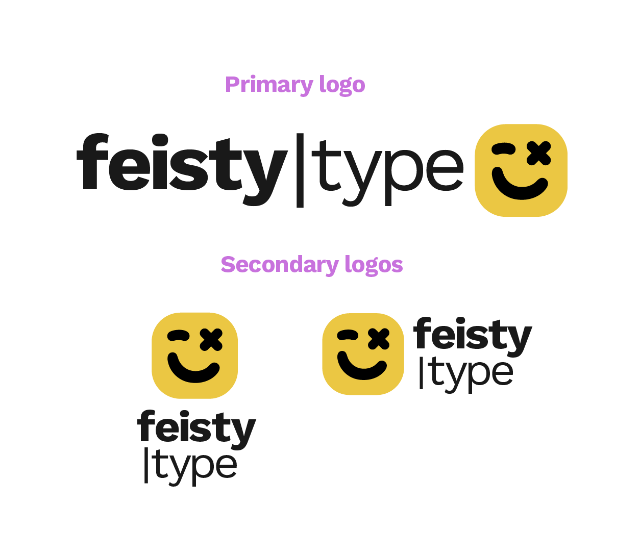
Word mark: I wanted the logo letters to communicate both the strong, feisty confident brand we are hence the bolded feisty while the type shows more restrained, elegant and minimal. for me the best design has always been about what can be removed without losing the message it’s trying to convey.
Signals the digital, screen-native side of the offer.
The mascot logo. I went against the grain of minimal word marks and chose a
mascot-plus-type lockup, and every decision in it is doing a job:
The app-ish shape. The rounded, icon-like container makes the studio feel like something you can just access when you need it, which is literally the fractional model of the business. I wanted the mascot to feel like a friendly virtual assistant, something you can reach whenever you need it, like an app icon on your screen. Always there, always ready to help.
The wink. A winky face suits a brand called Feisty. It's the pillar-four tightrope, solved in one glyph: playful, but knowing. It also helps when scaling to small sizes for identification.
The X of the other eye was to add a bit more uniqueness to the face, setting it further apart from the smiley face and suggesting a more feisty attitude. It also helps when the logo is at a smaller scale.
Born to animate. A mascot gives me an expressive character to bring to life: blinks, reactions, transitions. My logo is its own proof of concept for taking a brand from static to motion.
The colour palette. Two primaries doing the heavy lifting: a confident yellow, a rich off-black and off white, that gives the editorial page colour. High contrast, editorial, unmissable in a feed. Blue and magenta play support as secondary accents bringing the digital energy without diluting the core.
This is here the colour palette comes in. Yellow is joy, life, creativity and happiness, also the fastest colour you recognise. I had a few concerns about how the colour will look in print, but as the brand lives almost entirely online, I took the chance, for example for my branded stickers, they’ll have a black outline of add more definition. it’s an yellow is the extrovert of the palette,
The blue and the pink accent colour offer me more range
6. Outcome: what happened on the website
after launch
Feisty Type Studio launched in [month, 2026], so real numbers are still building, no pretending otherwise.
Early signals: In the first 30 days, the site saw 113 visits, up 40% month on month, with page views climbing even faster (+54%). Bounce rate is trending down. Most traffic so far is direct, people typing the site straight in or clicking through from LinkedIn and Instagram, which tracks: the brand is currently travelling through conversations and posts rather than search. That's the next frontier."
In daily use: the system speeds up content creation, and leading with the wink starts conversations a beige portfolio never would.
Still unfinished: the motion identity is rolling out in phases. A brand built on "static to motion" should never really be finished.
Check back at day 90 for real numbers: good, flat, and surprising.
Feisty Type Studio logo animations for different applications. 1 a fast paced logo sting, 2. the main logo with a giggle expression and 3. a little bing and spin when we need something for socials or video.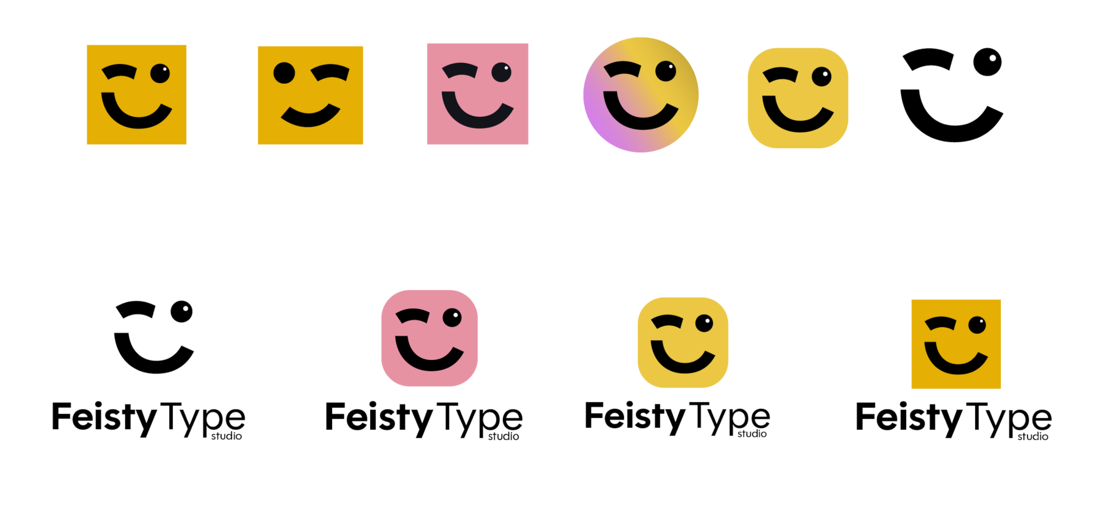
The final mascot didn't arrive fully formed. Early rounds tested the shape and colour independently of everything else: the winking face inside a rounded square, then the same face in pink, in a soft gradient circle, in a plain flat circle, and finally stripped right back to just the line art with no container at all.