
A local brand with presence
Services
Identity
Motion
Social Media
Background
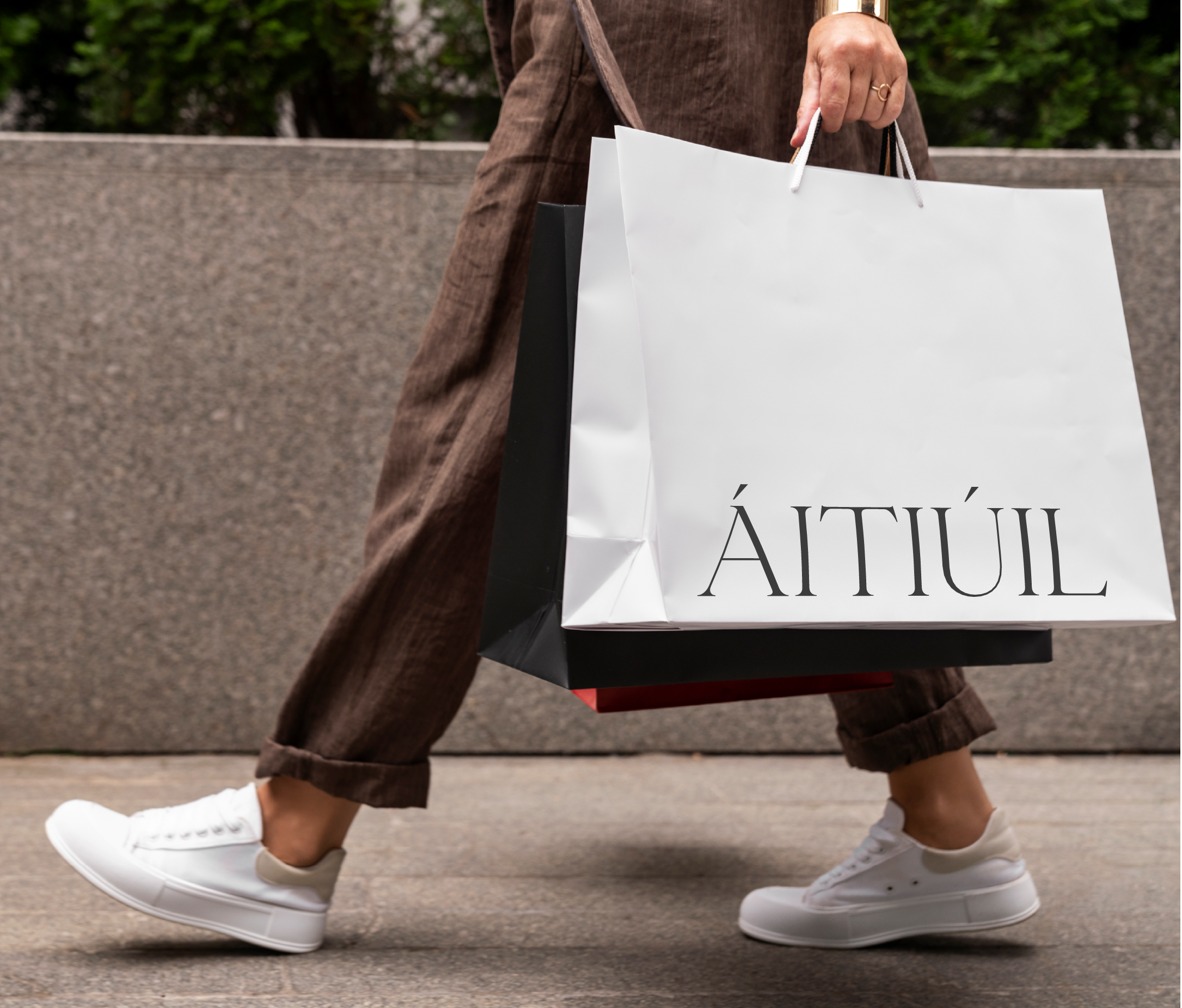
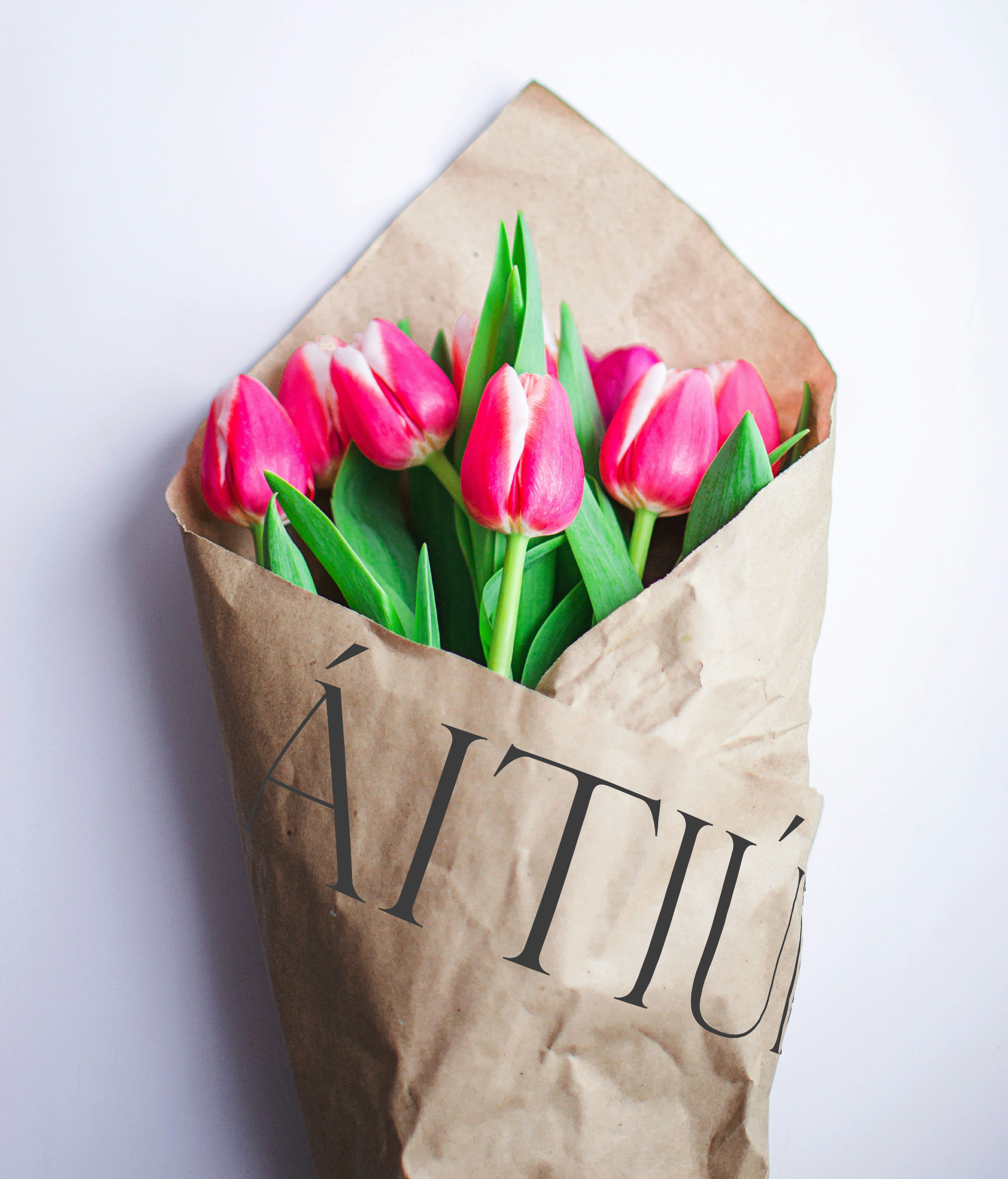
ÁITIÚIL is a local grocery store in the heart of Barna, offering freshly made sandwiches, salads, baked goods, artisanal cheeses, fine wines, and Irish-designed gifts. More than a shop, it's a gathering place for locals looking for everyday staples with a few carefully chosen surprises.
The challenge was to attract both locals and visitors while communicating the store's unique personality. ÁITIÚIL needed a brand system that worked across signage, and packaging and felt rooted in Irish tradition without losing contemporary appeal.
We developed a visual identity that balances heritage and craft with modern restraint. The result is a brand that feels timeless, warm, and unmistakably local, helping ÁITIÚIL move from hidden gem to recognizable village anchor.

Design
Typography
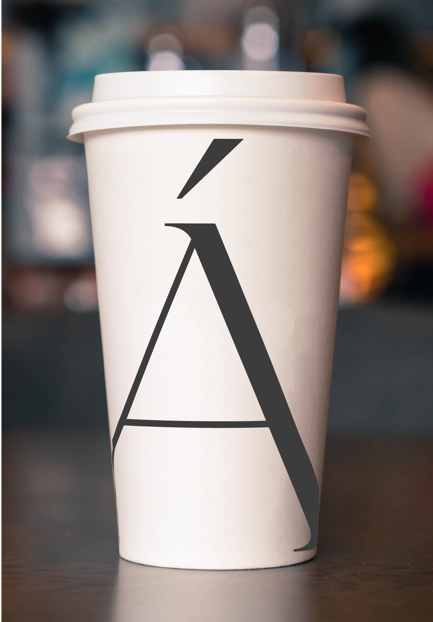
The primary typeface is Giordano Gold Serif, a high-contrast Didone with artisan energy and refined structure. It brings craft to the forefront without feeling decorative or overly traditional.
The secondary typeface is Trivia Serif Book, a quieter, more restrained companion rooted in the same Didone tradition. It's designed for readability at smaller sizes, making it ideal for subheadings, body copy, and packaging details.
Colour
The natural earthy tones in this palette feel emblematic of the landscape of Barna, drawing from the stone walls, coastal light, weathered surfaces, and muted grasses that shape the character of the place. These colours evoke a sense of quiet authenticity and local rootedness, reflecting the landscape’s understated beauty rather than trying to overpower it.

The challenge
Create a brand that reflects ÁITIÚIL's location, its commitment to Irish craft, and its community spirit. The identity needed to communicate quality, warmth, locality and consideration while remaining scalable across in-store touchpoints and digital platforms.

#3C3C3D
Black Marlin: This soft charcoal that anchors the brand and adds sophistication without feeling harsh.
Warm gray: a muted taupe-grey with a slightly warm undertone. It feels grounded, understated, and natural.
Strategy
We researched local competitors and explored themes around heritage, craft, and place. The visual system needed to feel elevated without losing approachability while remaining distinct.
The design centers on natural tones inspired by Connemara, paired with typography that signals trust, quality, and care. The logo reflects locality and craft without leaning into nostalgia or overworked rustic tropes.
Brand pillars
Rooted: Everything about the store is grounded in its place. Barna, the community, Irish craft and produce.
Warm: The experience feels like being looked after. Whether that's a familiar face behind the counter, a well-chosen wine recommendation, or the smell of something freshly baked. Warmth is both physical and emotional.
Considered: Nothing is there by accident. Every product, every supplier, every visual choice has been thought about. The "carefully chosen surprises" line in the copy says this well.
Timeless: Not trend-led, not nostalgic for its own sake. ÁITIÚIL draws on Irish heritage but wears it lightly. The identity should feel like it's been there forever and could be there forever more.
Place: The store is a social object. A reason to stop and chat. This pillar speaks to the role it plays in village life beyond pure retail.
#F8F7F4
Off-white: An off-white that keeps everything airy, clean, and boutique-like and provides a secondary contrast colour.

#DAD7C8
Fennec Fox: A warm stone-beige that brings an organic, natural, pantry-like feel.
Outcome
A complete branding toolkit including signage, packaging, menus, and digital assets. Applications include sandwich wraps, wine tags, gift labels, and in-store graphics — each designed to reinforce quality, locality, and warmth across every customer touchpoint.
#8A898A
Neutral gray: This is a cooler feels calm, refined, and quietly modern, so it works well for structure and typography.