
Where sensors
meet soil:
Where sensors meet soil
Background
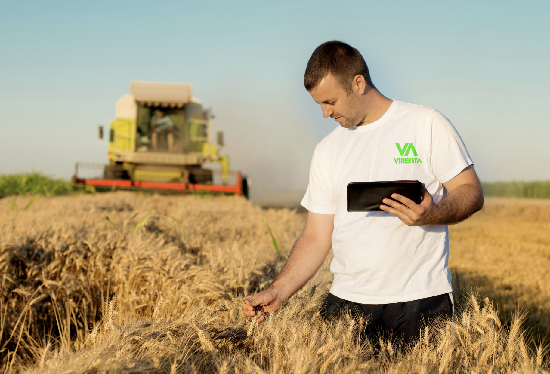
Virenta uses the Internet of Things (IoT) sensors to track soil carbon capture in real time, turning farmland into measurable climate infrastructure. The brand needed to communicate that this is not a vague sustainability story, but a science-led system built on data, measurement, and trust.

The challenge
Carbon farming had an image problem. To corporate buyers and regulators, it sounded fringe, too activist or too niche. To environmentalists, any "tech" felt suspicious. Virenta needed to bridge both camps with a single, confident identity. The challenge was to create a brand identity that could carry both ecological ambition and technical credibility. Virenta sits at the intersection of regenerative agriculture, carbon science, and digital monitoring, so the identity had to feel rigorous enough for a science-minded audience and clear enough for a broader market.
Strategy
The strategic goal was clear: build an identity that carried ecological ambition and technical credibility in the same breath. Virenta sits at the meeting point of regenerative agriculture, carbon science, and digital monitoring, which meant the brand had to feel rigorous enough for a science-minded audience and approachable enough for everyone watching from the outside.
We led with typography and a restrained, evidence-led visual system to earn the trust of the technical crowd, then used motion to bring warmth and momentum to the story, showing carbon data and natural systems as something living and in progress rather than static and clinical. The result is a brand that signals proof and progress at the same time, giving Virenta one voice it can use with confidence across every audience.
Design
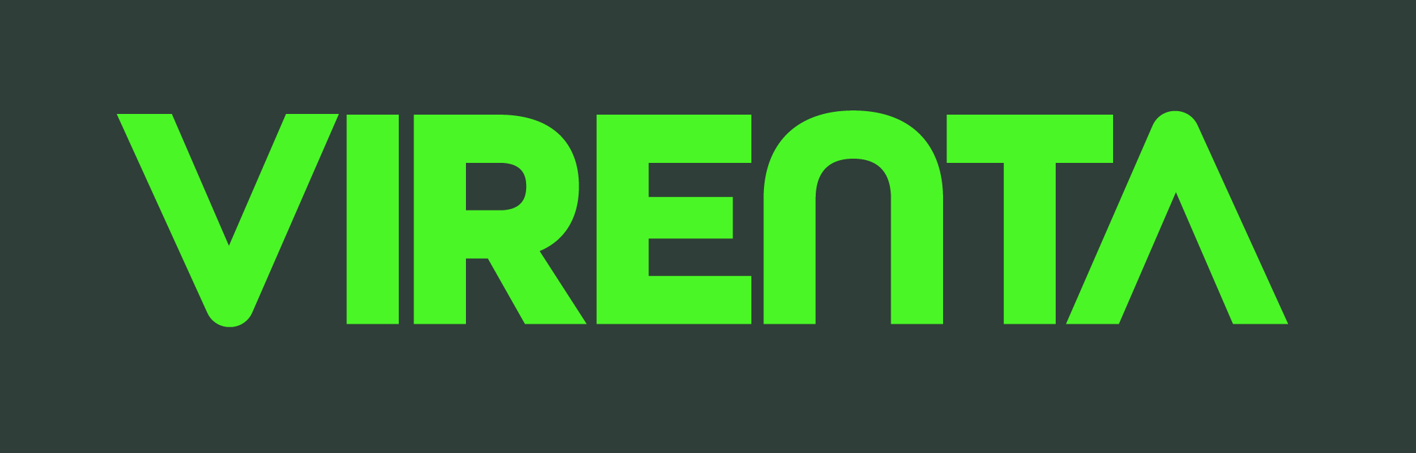
The Visual Language: The brand is anchored by a heavyweight sans-serif typeface called All Gothic Round. This choice communicates stability and "boots-on-the-ground" reliability. It’s a font that looks as good on a digital dashboard as it does embossed on a steel soil sensor.
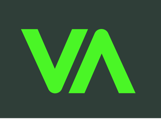
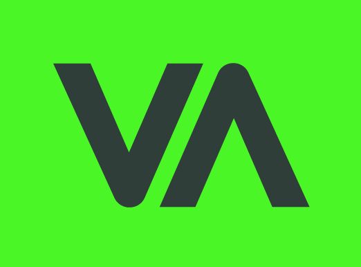
The Signature Mark (The V-A Junction): The core of the visual identity is the custom ligature where the "V"(Vitality/Earth) and the "A" (Advancement/Tech) meet.
By connecting these two letters, we visually represent the "closed-loop" system—reminding the viewer that technology and nature are no longer separate paths. They are one single, strong line.
Built for the field: A bold sans-serif stays clear and legible across sensors, machinery, and fleet—designed for harsh light, dust, and distance, while reinforcing Virenta’s high-tech edge.
The Strategic Insight: Most environmental brands use soft, leafy imagery that feels fragile. To win the trust of industrial farmers and global investors, Virenta needed to feel unbreakable. We moved away from "Green Peace" and toward "Green Infrastructure."
The V (Vitality) and A (Advancement) meet to form a single, unbreakable point that symbolises a world where we don't just take from the earth, we give back.
Brand Pillars
The visual identity was built upon three core business tenets: Industry, Scalability, and Urgency.
Industry: Reflecting a grounded, robust expertise in the sector.
Scalability: Signaling a forward-looking infrastructure built for exponential growth.
Urgency: Communicating fast deployment and high-priority responsiveness.
Basalt Green #2F3E38 is a deep, muted forest/charcoal green. It reads almost as a dark neutral while still carrying organic warmth. It functions well as a primary background or base tone
#2F3E38D
#4AF626
Krypton is an electric, high-saturation lime green. It's the energy of this palette, eye-catching, bold, and unmistakably digital. Used sparingly, it commands attention instantly.
#D1D5DB
Silicon Silver is a soft, cool light gray. It provides breathing room and balance, functioning as a body text base, surface colour, or secondary tone against the darker shades.
Services
Branding
Motion
Social Media Assets